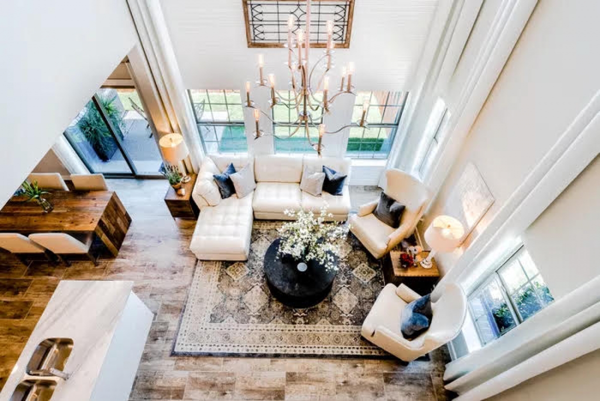
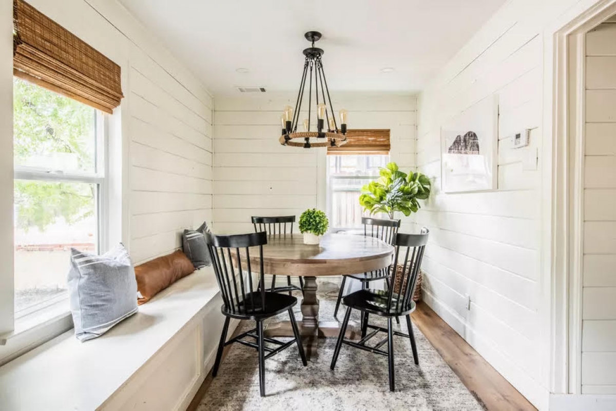
Mistakes in arranging furniture that you should know
1. Don't consider chat areas
No guest wants to scream, lean forward, or tilt their neck to talk to you in the living room area. When arranging your living room furniture, keep in mind that sofas and other chairs should be placed facing each other to facilitate conversation. In large spaces, you can create multiple chat areas in one room.
2. Putting furniture too close to the wall
This may seem counterintuitive, but if you want your room to look bigger, then pushing all the furniture against the wall is not the way to go. Doing so can cause the areas in the middle to be too far apart and make them appear rather disjointed. Pulling furniture away from the walls will bring the conversation areas closer and create a more balanced feel. Even in a room with limited space, you can arrange furniture suitable for small spaces.

3. Ignore practicality
You should arrange furniture so that you can easily put down drinks or corresponding shelves to display food in the kitchen. In addition to decorating to beautify the house, you should also pay attention to the practicality of the furniture. Instead of decorating too elaborately in front of the house, you should put a small shelf to store shoes, bags, keys and many other daily items.
4. Decorate around more than one focal point
Each room should have a focal point because it fixes the space and you can create an area to place furniture around and decorate your home. The most important thing to remember is that there will be a focal point in the room, otherwise the room can become cluttered and confusing. To create an elegant and balanced space, you will need to selectively decorate your room.
5. Narrow passage way
When arranging furniture, don't forget that you will have visitors and no one wants to climb on or over one piece of furniture to reach another. So make sure your furniture is decorated at eye level so everyone can see it and make sure you've left room for aisles.
6. Lack of balance
Putting too much furniture on one side of the room makes everything feel tilted and out of balance. To avoid this, distribute everything evenly in the space. This does not mean that the rooms have to be completely symmetrical; however, it is important to have a relative balance. For example, if you have a sofa on one side of the room, you should balance it with something of equal visual weight on the other side. It could be another sofa, a pair of chairs or a dresser.

7. Covered window
Natural light is important in any room so the more windows your home has, the better. As a general rule, you should avoid placing things in front of a window so that light can enter the room. When light is blocked, the room feels smaller, stuffy and cramped. However, this can get complicated if you have floor-to-ceiling windows. If you absolutely must place furniture in front of windows, make sure you maximize the remaining, natural light, through the use of mirrors, reflective surfaces and a smart lighting scheme to add light for the room.
8. Inappropriate space
A common mistake is not considering the different activity zones when arranging furniture. Your living room is used for many things like people watching TV, doing homework, paying family bills or doing art projects. However, you should leave the study of the children, the workplace in the bedroom or personal office to ensure concentration. Make sure you arrange everything according to the specific needs of each activity to have the right seating, lighting and space to reflect the flexibility of the space.
According to VOV
The post https://meo.tips/tips/mistakes-in-arranging-furniture-that-you-should-know/ appeared first on Meo.tips.
View more from Meo.tips:
Comments
Post a Comment